Magic at the edges: Q&A with cartographer Aaron Koelker
We chatted with map maker Aaron Koelker about how he designed the Lower Deschutes Ribbon Map, his creative process, and what he loves about maps.
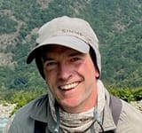
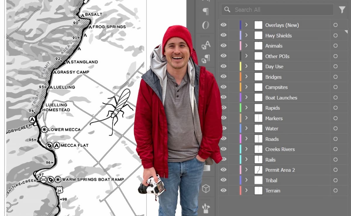
Aaron Koelker is an award-winning cartographer and GIS specialist with the State of New York. Over the last year we've been working together to design the Lower Deschutes Ribbon Map.
Now that the project is out in the world, we caught up to talk about his process, the specific quirks of the Deschutes topography, and what he loves about making maps.
Aaron! It's been just over a year since we got together, and now, thanks mostly to your hard work and great design, we have this beautiful map. What was it about this project that made you decide to say yes?
I've made a few ribbon maps now, and the ones I've made have just been personal projects. Places that interested me, like the Suwannee and the Wakulla. But I wasn't making them for a specific purpose. It's nice to make one that actually had a function, rather than some little thing I make for myself and keep. And I recently started messing around fly fishing, so that was also cool timing.
On your portfolio site, you described the Wakulla map as "perhaps the most unnecessary thing I've ever made." But it feels like we've actually overcome that with this material and this map. It feels a lot more durable and functional.
The paper I have for these other ones, if you tried doing anything with those outdoors, they would shred immediately. I'd actually love to, a year from now, hear from people that take one of these out there. Hear how it holds up.
Let's talk about your process. What are the macro steps you take when you're making a map?
A lot of the stuff I do, it's something I'm personally interested in. So, I usually have a book or something I'm reading. And that's "research". You did a lot of the work for me on the research side, helping to get stuff together, and making a list of things that were going to go on the map. So I'm getting in the head space of the project, and getting a sense for the place that I'm going to be mapping. And then from there, thinking of what's interesting or what's worth including on the map.
Getting all the data sources together usually takes a lot of time. There's usually an amount of creating my own data sources. I didn't do it as much on this one. I'm not making my own elevation data. River data, I tweaked a lot of that. USGS has pretty good water data for the whole country. And you can get "polygon data" of the rivers, where it's the actual surface area of the water, so you can see all the islands and stuff, and where it gets narrow and wide, versus just a solid line.
For all these river maps I've done, I start with the USGS data, but then end up making my own. For example, tracing water from aerial imagery. The USGS data are never quite as detailed as I want them to be, or they'll be kind of incomplete. That's the same with the other data that goes on the map. Reviewing all the data sets I want on there, and then seeing if it meets the level of completeness that I'm looking for.
Testing how to show the terrain
Once you have all that data together, the next step is planning how you're going to fit it onto the map. We had a limit of six feet. That dictates the scale, the resolution, and the density of stuff we're going to have on it. If we didn't have a limit, then I might play around to find what's the right balance. How much can I get away with, or how long can I make it before it gets unwieldy? From there, I did a whole bunch of test layouts where I export out all the data in its true-to-form shape.
With the ribbon map, we've straightened the river out. We've warped all the data. Before I warp the river, I'll print out an image that has the actual true shape of the river. And then I'll bring it into a layout that I think might be the final size of the ribbon map, and I'll start dicing it up and bending it. I'm working it to see if it is all going to fit. Is it going to overrun the size of the layout I thought we were going to be working with? There's a bunch of trial and error to figure out what sizing we have to do, to get it to fit. We obviously have to fit it on the map, but then we also don't want it to be too small. We don't want a six-foot map, and then the river's only taken up three feet of it because we started with the wrong scale.
What program or suite of programs are you using for this composition?
Working with the GIS data, I use a GIS program. QGIS is the big open-source one. That's not only for looking at the GIS data, but if we need to do any work on it. When I generated the river mile markers, that's a GIS workflow. Repositioning the data, generating the shaded relief, that was a GIS workflow. But then the bulk of the work is bringing all that data in vector format over into something like Adobe Illustrator, some sort of vector editing program. That's sixty or seventy percent of the actual work, moving stuff around in Illustrator. I ended up doing all the labeling by hand. You can auto-generate labels in your GIS program, but I always end up manually adjusting them all anyways. The doodles and icons, I use Procreate on the iPad.
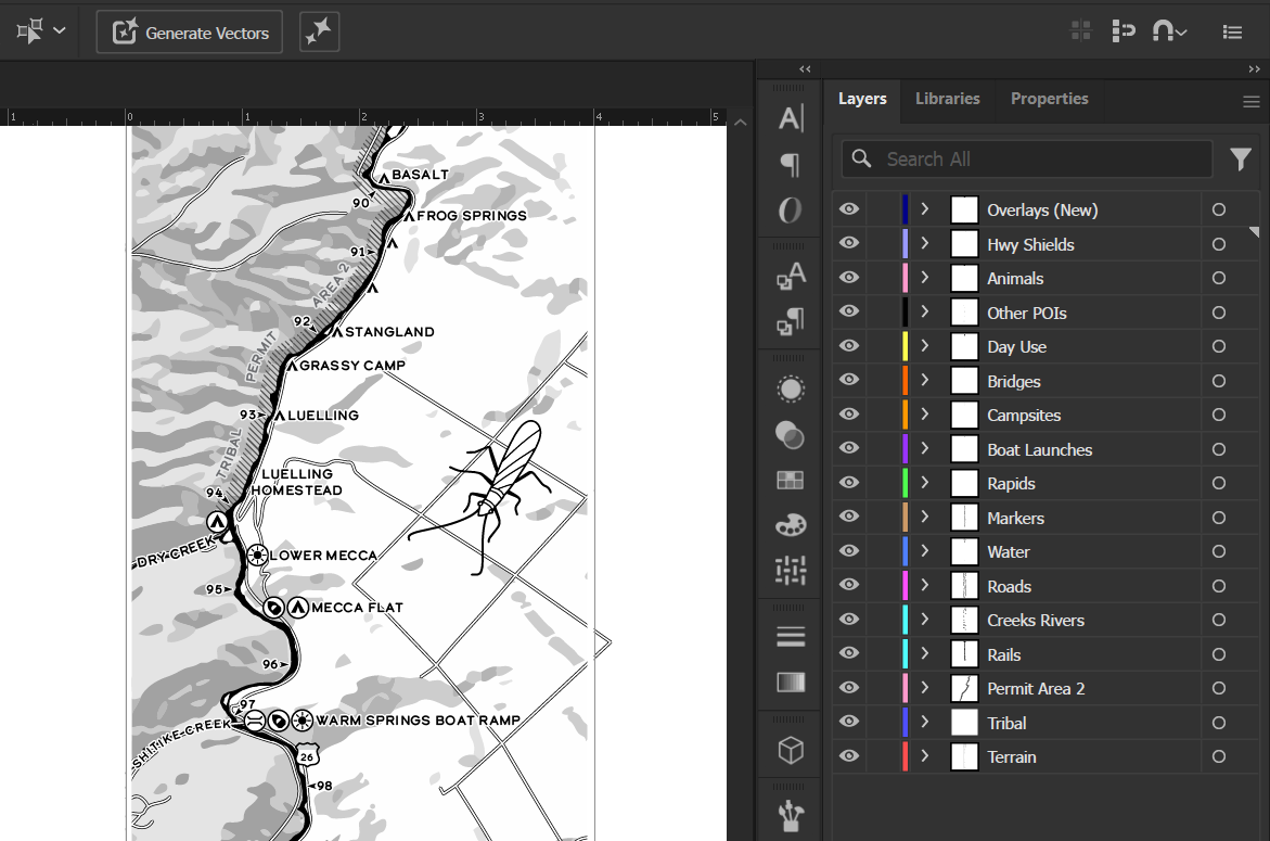
For this project, I did use Blender, an open-source 3D modeling program. Blender is a really powerful software. You can do 3D modeling, you can do video, you can do animation, you can do drawing, the software does just about anything.
It's not meant for GIS work, but I used it to work the terrain, and work the shaded relief into a straight line. It's really good for projects where you're mixing a bunch of different types of data or illustrations and bridging different pursuits. And a little bit of Excel for tabular data.
I would not have guessed Blender. I associate Blender with creating 3D images.
Blender's getting more and more popular with GIS work, especially for 2D/3D blends of data where you make your maps look like they're 3D. People use it for casting light and shadows realistically over their data.
Was there anything specific about the character of the Deschutes that influenced the mapmaking process?
There was nothing too crazy in there. It was actually kind of forgiving, especially the scale we were working at. A lot of the bends on the river are kind of smaller. We didn't have to worry about straightening those out. The broader grand curves are pretty gentle, and there weren't too many of them.
What were the biggest challenges?
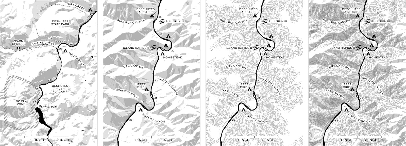
Definitely the terrain, to show the shaded relief. It's the first time I've attempted that on a ribbon map. So, backing up. You have two types of GIS data: Raster data and vector data. Raster data, if you think of a JPEG image, it's a grid of a bunch of different colors, right? If your photo is 100 pixels by 100 pixels, you've got 1000 pixels. And then you have vector data, which is not pixel-based. It's based on math. You're saving the angles and the curves into the file as mathematical relationships. And when you bring it into your program, it's drawing those vector images on the fly. Vector stuff is nice because you can stretch it and distort it and size it up and shrink it and it's always gonna stay nice and crisp. The raster data, you start messing with that and the warpage becomes really clear.
One of the first tests we did, on one bend of the river, the shaded relief looked like it smeared, and it was melting, because I tried to bend [the raster data] too hard. When I had entirely vector data, I could bring them into Illustrator and manually grab everything, clip it and swing it and straighten it out. But I can't do that with the raster data because I'd have these huge gaps that I have to fill in.
An example of how Blender manipulates the elevation data (left) while Aaron manipulates the UV map (right)
To get around that, I started with elevation data, which is raster-based, like a height map. If you've seen one, it's usually the whiter the pixels, the higher it is, the darker the pixels, the lower it is. I brought that into Blender. Then with Blender, I used a feature called UV editing. You can do an on-the-fly map projection where, rather than warping the data by hand, I'm creating a custom map. And then when you load the raster data into that projection, Blender is really good at filling the gaps between those parts you cut and pulled and stretched.
The method with Blender actually works pretty good, and I'm pretty pleased with how it came out.
Once you bring in that raster data into Blender, then you send it back into GIS. And then you can tell the GIS, "Hey, do a hillshade on this." We don't really care that it's not spatially accurate, because we've warped the heck out of it. But the GIS software doesn't really care, either. You can just tell it, "Here's the elevation data. It doesn't matter where it is. Do a hillshade on it." Which it did. And then that, we can vectorize that into simple shapes and bring that into Illustrator.
It sounds like you were really pushing the boundaries around how that information can be displayed.
I don't know how much you know or care about map projections. But the Earth is a globe, right? Where if you try to put that flat into a map, maybe you've seen the orange example. It's like taking orange and peeling the orange. And you can flatten it out, but your orange is going to be this crazy, spiky, splotty-looking mess.
Map projections ask "How do you compromise between that and the nice rectangular world map people expect?" There's no existing projection specifically for straightening out the Deschutes River. So that was the challenge behind it: Making a custom projection to straighten the river. Projections are very math-intensive. I'm terrible at math. So rather than doing the math, I was doing it by hand and then letting the software do the math behind it.
“There's no existing projection specifically for straightening out the Deschutes River. So that was the challenge behind it: Making a custom projection to straighten the river.”
Map projections were in the news when that Greenland nonsense was happening.
No map projection is perfect. They all distort in some way. It's about finding the one that distorts the least for whatever you need it to do. Mercator was originally designed for navigating on boats. It's really handy to go from coast to coast on a straight line. But yeah, obviously, it distorts all the shapes. Other map projections are really good at preserving the shape, but hard to navigate with. The projection for this map, I don't know what it would be called. And all it preserves is the river going up and down the paper. That's the only thing it's best at, I guess.
Did you include any Easter eggs or trap streets or anything like that?
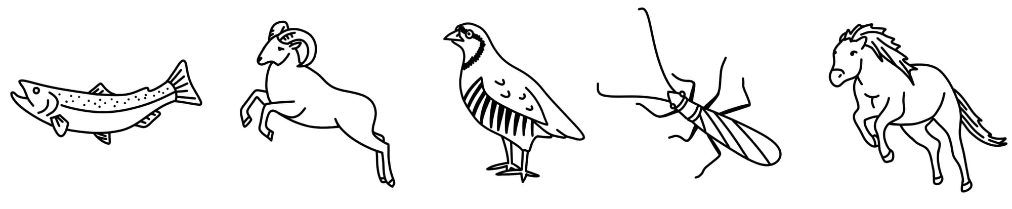
I did not. I strongly considered it. Most of my maps, I actually have stuff like that. I really like having an "X marks the spot" for something. And usually it's some random thing, like, "Oh, this place has a really nice bench that you might like to sit on," something like that. And I'll put an X on there and that's just kind of for me. I didn't put one on here. One because I've never been here. We got the animal doodles on there. Those are fun.
Do you remember the first map you ever made?
I don't know if it's the first one I made, but in middle school I'd write a bunch of stories. I was super into Lord of the Rings. And I remember wanting to write Lord of the Rings fan fiction. I don't think I ever wrote the story, but I was like,"Well, you got to start with a map. I'm going to send these characters somewhere else, I need a map." So, I remember working on a map in school with pencils and stuff.
What do you love most about making maps?
I've always liked making stuff. I did a lot of drawing and painting and arts and crafts and stuff as a kid. I always liked just looking at maps. In school textbooks, I would always flip ahead to the maps. In a history book, I always liked looking for the cool battle maps. When I was an undergraduate, I studied environmental science and it took GIS courses for that. I liked the creative side of it. It felt cool to make something that can solve problems, but you also might hang on a wall. It can be art, and a problem-solving tool, at the same time. I thought that was really cool.
“It felt cool to make something that can solve problems, but you also might hang on a wall.”
The more I've done it, the more I really like maps as a storytelling device. I think it's really cool to like look at a map of an old place and see all the random features on it and think "What happened there? Why is that like that? Where does that go? And what's going on there?"
Maps are a great springboard for learning about specific places that you're not really familiar with. I love doing that. We have this huge used book sale they do twice a year here in Ithaca and they have this huge map section. It's just like full of pullouts from Nat Geo magazines and like roadmaps and sometimes really weird stuff. I love going in there and digging through that and grabbing every random map I can find. and then looking at them and learning about all these cool different places.
You can find more of Aaron's work on his website.
If you haven't picked up a Lower Deschutes Ribbon Map yet, you can order one below!
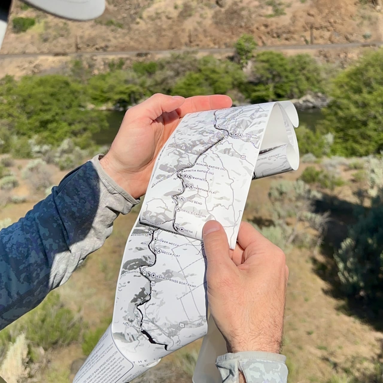
Six feet long, with hundreds of features, the Lower Deschutes Ribbon Map is your passport to adventure on one of Oregon's blue ribbon fisheries.
100% of every map sold goes to benefit the Deschutes River Alliance!